An UI kit à la française Prompt by
Louvre — 2024
Pack you bags! We're going to Paris
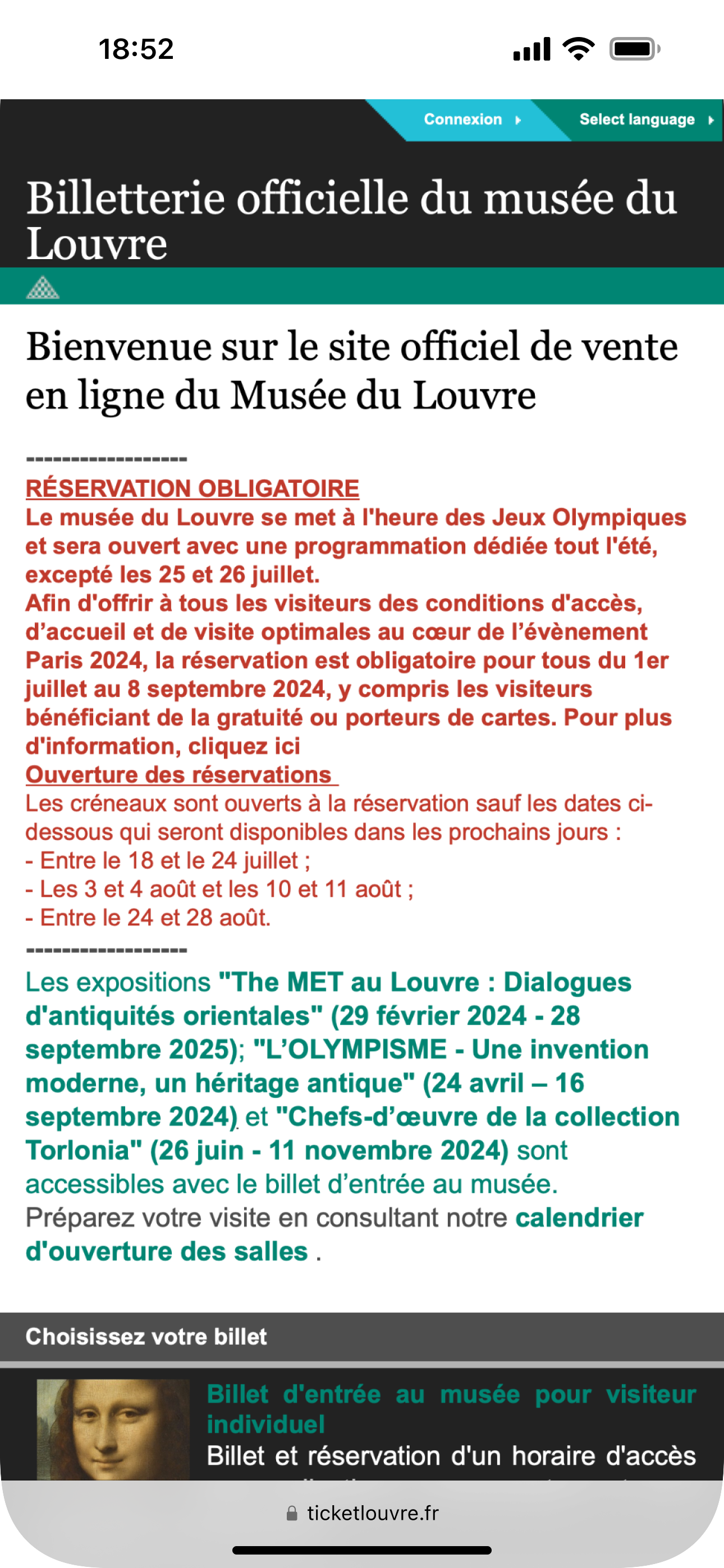
This challenge is about creating a mobile UI kit for the Louvre museum. In my opinion, the main website is fairly well designed, still I saw an opportunity for its ticket-purchasing site .
Un peu d'air
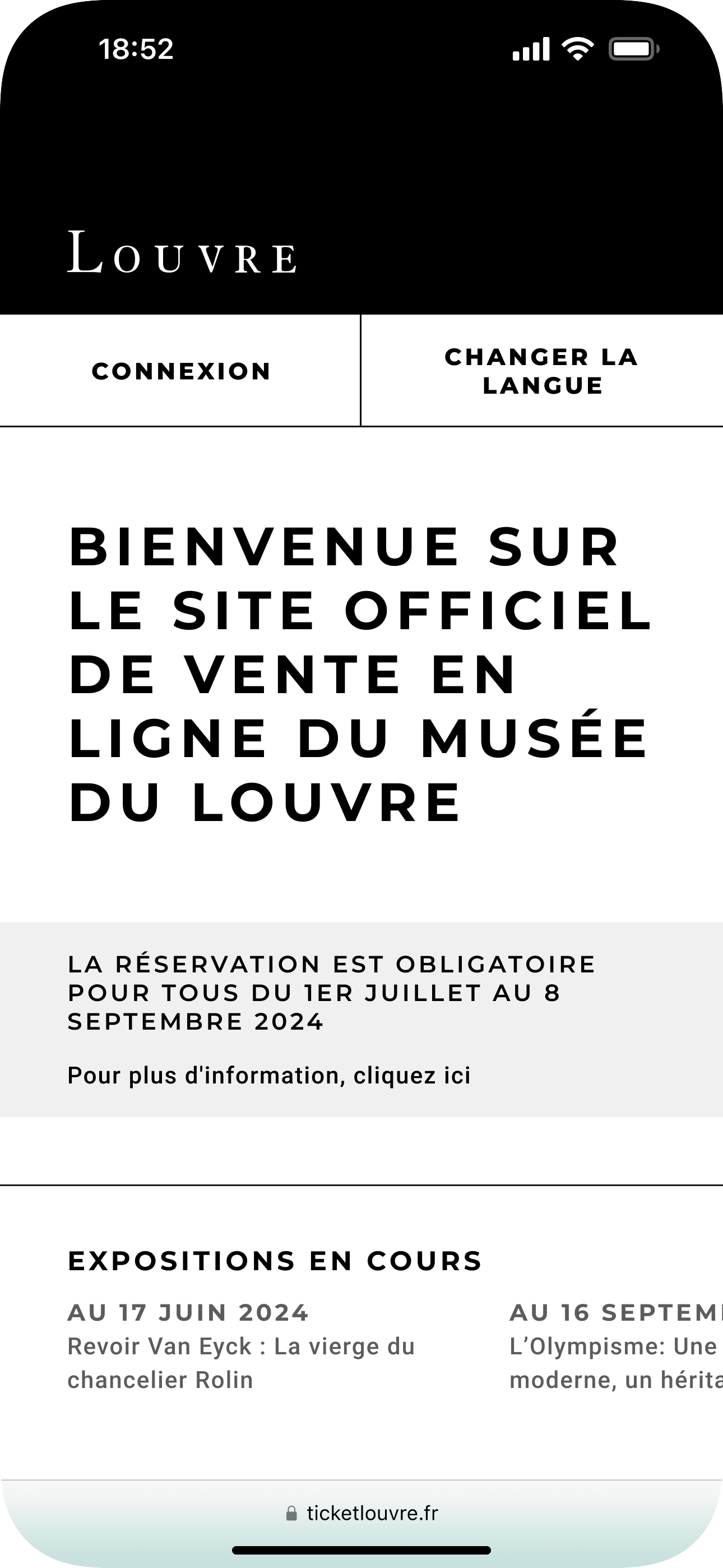
The overall screen looks breathing and current exhibitions are available at a glance.
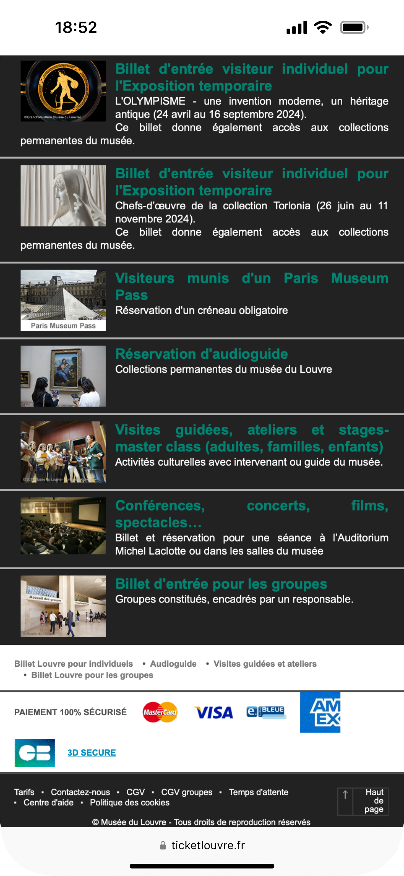
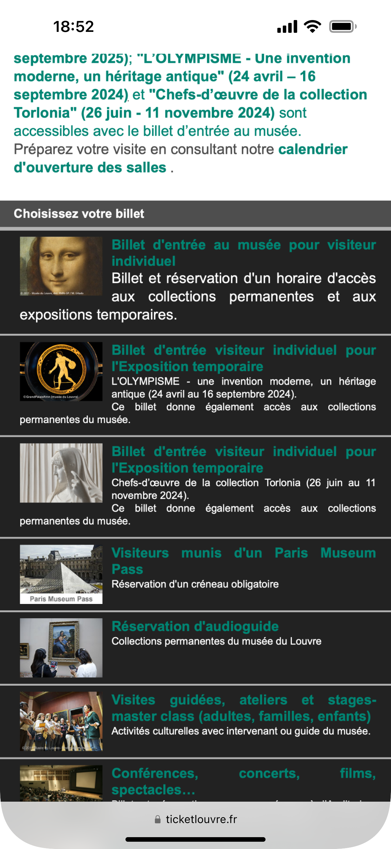
Au revoir to images
They were unnecessary in my opinion. Plus, text sizes were enlarged and contrast was adjusted
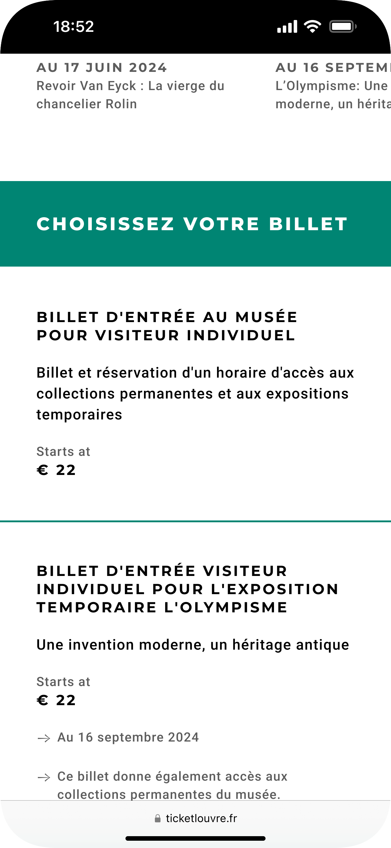
The new components follow the look and feel seen on the main website at that time.
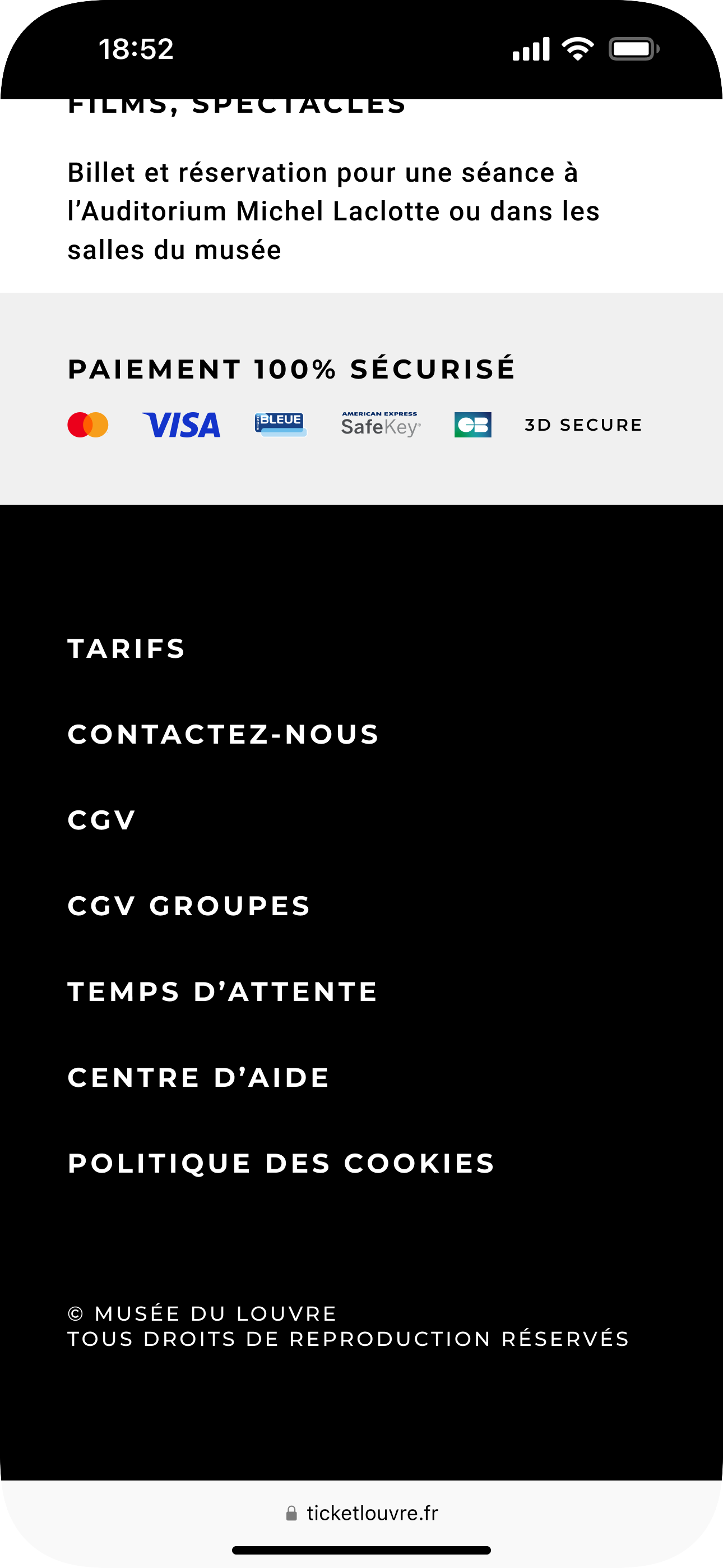
The new footer is evidently much more appropiate for mobile, right?